Text Button
The Text Button is a customizable two-state button which
displays text and an optional indicator. Drag and drop
the control or indicator you wish to associate from a
control panel or the Design Pane onto the Text Button.
In addition to parameters within the Properties pane the appearance of the Text Button can be customized by assigning colours and text styles from the Gallery. A 'Wave file' can also be assigned from the Gallery to give an audible indication when the button is 'on'.
Properties
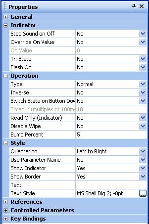
Stop Sound on Off
When set to 'YES' the sound will be terminated when in the 'off' state.
Override On Value
If enabled, the 'On Value' can be overridden. Otherwise, 'On' equals the maximum value
On Value
Sets the value to be considered as On, i.e. when set to 'Off', the indicator will show an 'off' state when the button is 'on' and vice versa.
Tri-State
Enable this to allow parameters with three values to act as a tri-state on/off.
Flash On
If enabled, flashes the indicator when the parameter is On.
Type
Sets the type of button to be used. Normal, latching, momentary or timed.
Inverse
Used with momentary buttons only. When set to 'Yes', the operation of the button will be the inverse of normal operation. So if in normal operation the button state is 'off' while it is held down, it will instead be set to 'on' while it is held down.
Switch State on Button Down
When set to Yes switches the state of the button as soon as the mouse button is pressed down. In normal operation the state of the button does not change until the mouse button is released.
Timeout (multiples of 100ms)
Used with timed buttons only. Sets the time that the button will remain in its changed state before reverting back to its 'normal' state.
Read Only (Indicator)
When set to Yes the button will ignore button clicks and act as an indicator only.
Disable Wipe
Wipe can be enabled for all control objects using the General tab of the File Preferences dialog. It is used to quickly change the state of a group of control objects. When enabled, a group of control objects can have their states easily changed by clicking on the first object and then dragging the mouse over the others.
When set to Yes, wipe will be disabled for this object.
Bump Percent
The amount to bump up or down as a percentage of the parameter range.
Orientation
Sets the orientation of the button. Left to Right, Top to Bottom or Bottom to Top.
Use Parameter Name
Set to Shortened or Full to override the text in the button to that of the name of the parameter being controlled.
If set to Shortened, a shortened version of the parameter name will be used. This is useful for Parameter Presets.
If set to Full, the full parameter name will be used.
Show Indicator
When set to Yes the (light) indicator will be displayed on the button.
Show Border
Displays a 3D style border on the button
Text
Enter any text to be displayed on the button here.
Text Style
The font of the text.